
Unseen Diplomacy 2 is out now on Meta Quest and Steam VR. Where did our unique art style come from? Why did we do it? And how is it more immersive? Let us share the development of it with you today!
A Classically Clunky World
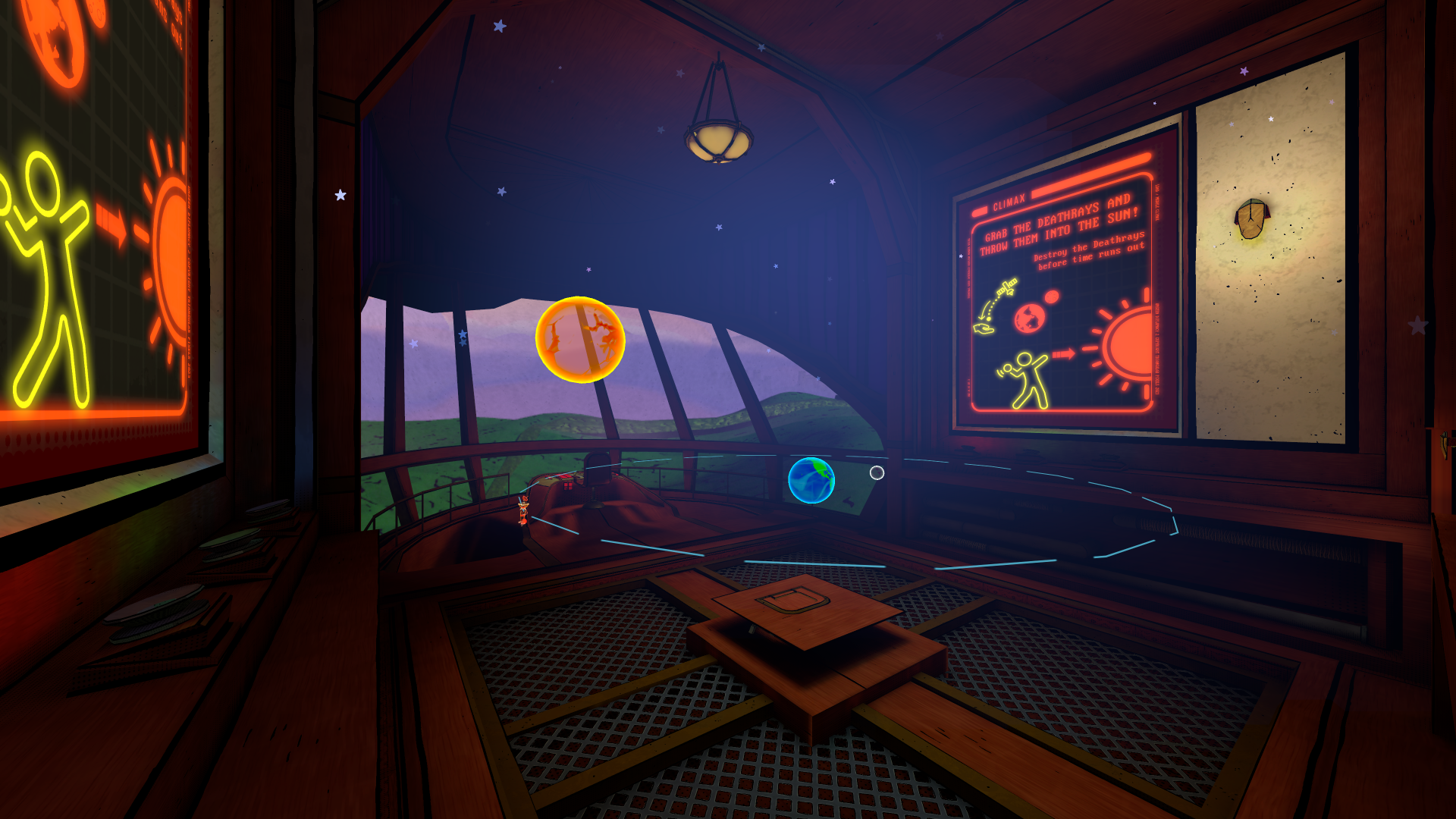
Unseen Diplomacy 2 is set in a distinct time period, where clunky 90s tech has started to rule the land. A place where spies could sneak by with just an outfit change and a lifted keycard. You’ll explore villain’s labyrinthine lairs, deep cave systems, superyachts and more. These locations all have strong influence from mid-century modern and retrofuturist stylings, making you feel like you’ve stepped back in time to where spies saved the world as a routine! This was a natural approach with our comic book style as we could draw from a wealth of art, from Syd Mead to Golden Age comics and more. Everything we’ve built is rooted in what came before. Each location feels personal and distinct to explore. You’ll never be quite sure what you’ll find around the corner, maybe you’ll stumble into a personal cinema, ancient death trap or a toilet.
A spy without gadgets is no spy at all, they have to have gadgets that feel like the best spy kit you could ever get for Christmas! To fit the 90s theme, our gadgets are chunky and clunky. We drew on early tech as inspiration, back when it wasn’t clear if a mobile was a phone or a brick. With our comic book stylings, all of the gadgets are unique and eye-catching, keeping their functions recognisable and tactile. You’ll find an array of gadgets with yellowed plastic bodies, warm mid-century wood or even cobbled together bits and bobs.
A Spy Story Told in Panels
When we set out to build Unseen Diplomacy 2, we knew we wanted more than just a sequel. We wanted a look and feel that stood apart – something clean, crisp, easy to read in VR, and undeniably cool.
We took inspiration from two of our biggest artistic loves: the cel-shaded espionage of Ubisoft’s XIII, and the bold, graphic posters of classic spy films. The result is a comic book styling that doesn’t just look good, it supports gameplay, accessibility, and immersion in ways that surprised even us.
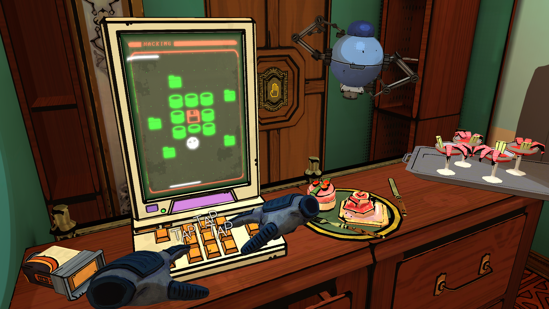
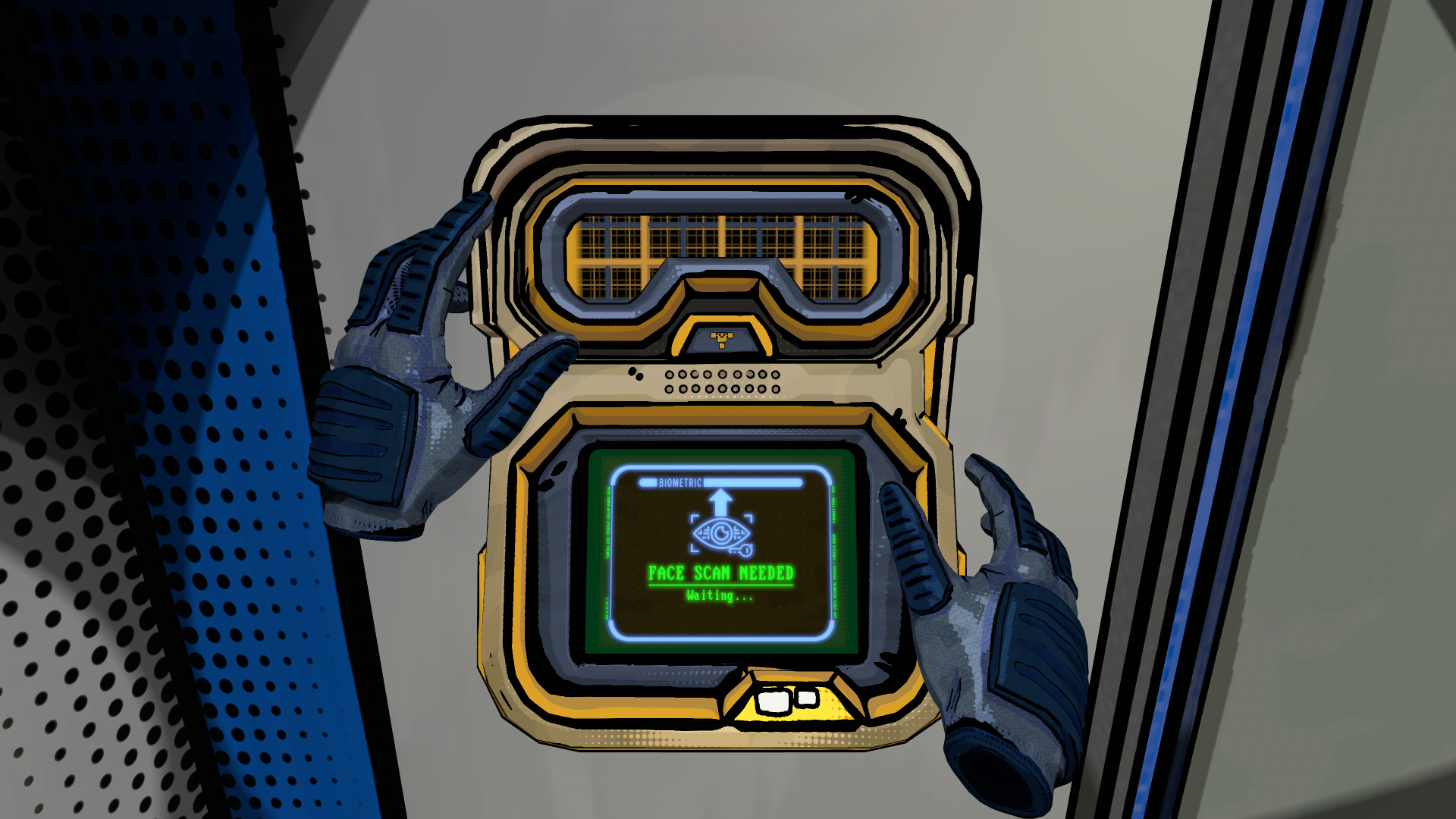
Diegetic UX Through Comic Design
One of the biggest challenges in VR is communicating with the player without breaking immersion. Instead of overlaying menus or distracting UI, our comic styling gave us diegetic excuses for the UX we needed:
- Hints and objectives appear as stylised visual cues, naturally part of the comic world.
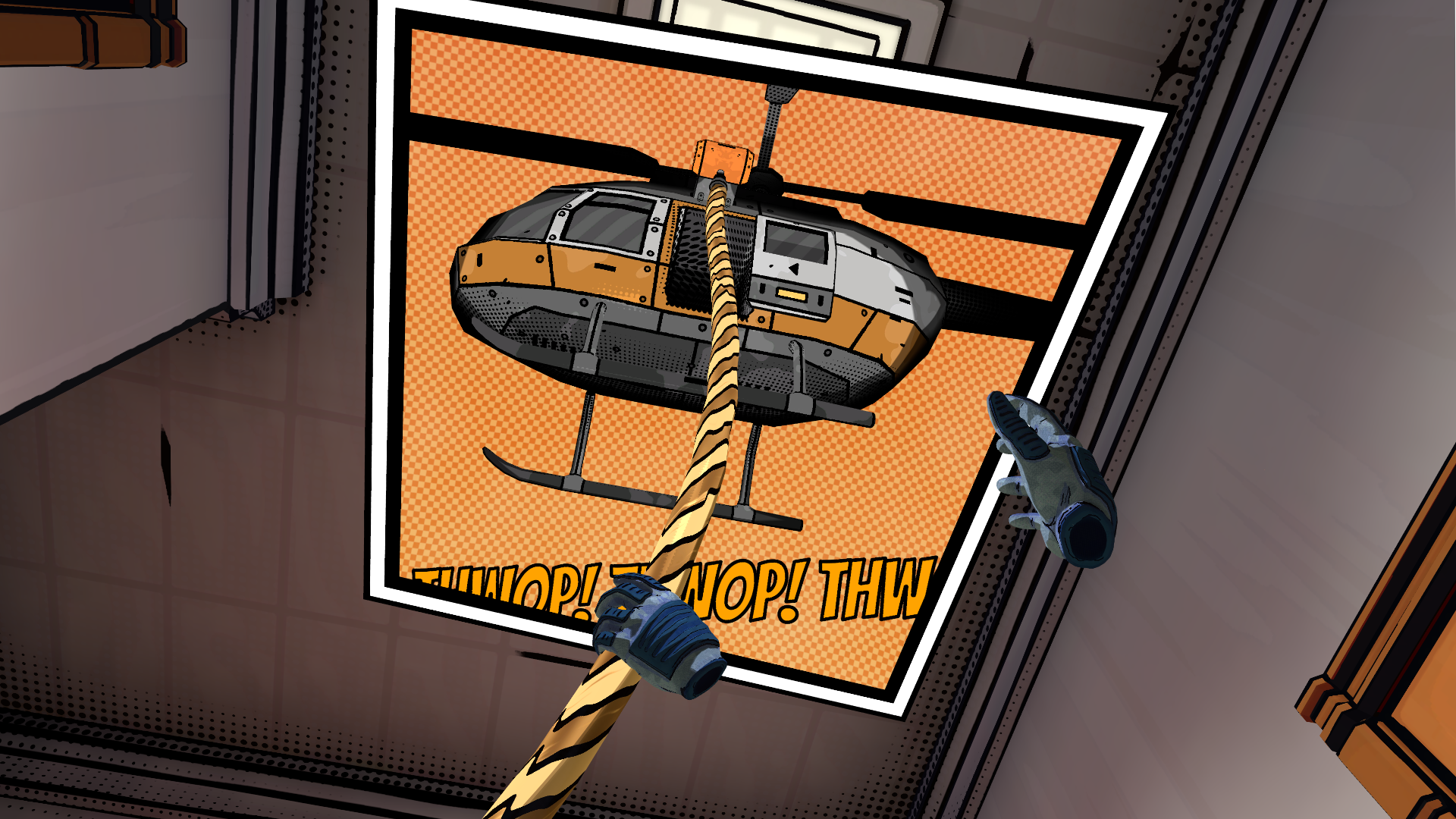
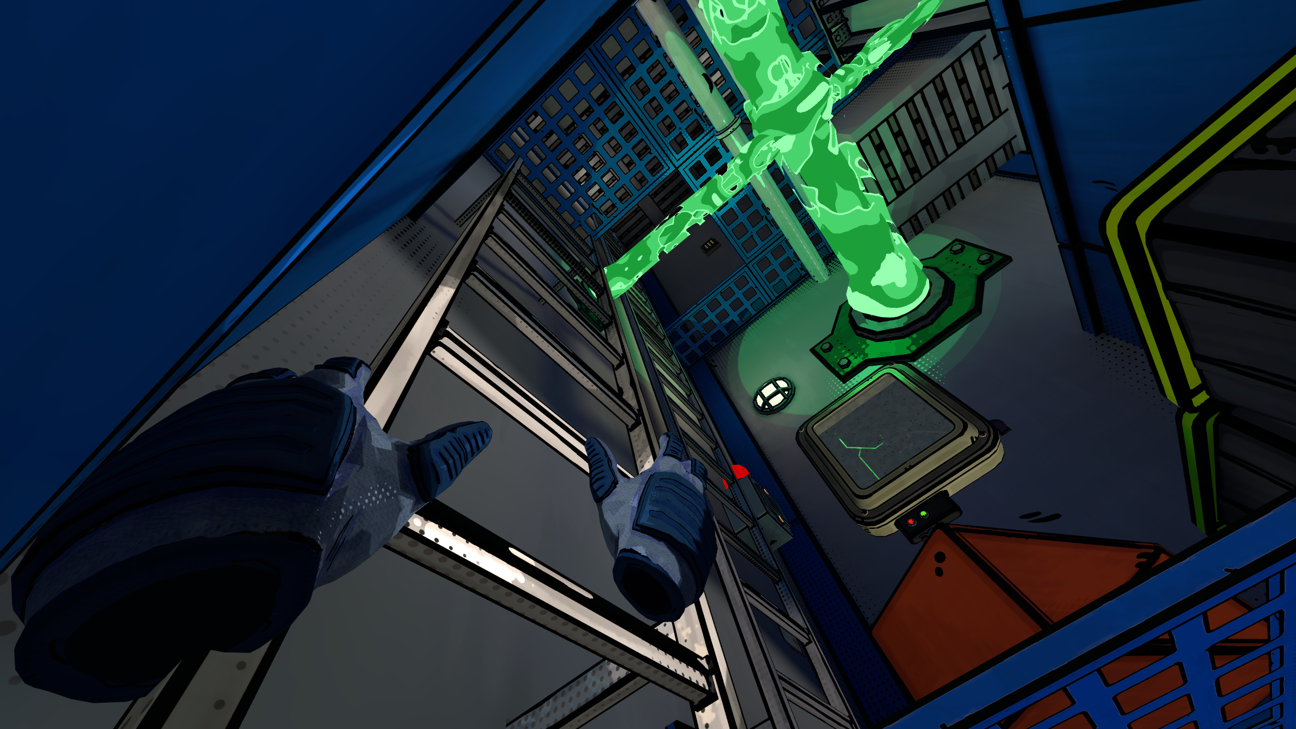
- 3D comic book panels pop up like postcards to highlight key events – so even if something happens behind you, you won’t miss it.
- “Ono text” onomatopoeia effects (“BANG!”, “CRASH!”) burst out of the environment in sync with sounds. This not only feels playful, but also helps hearing-impaired players or anyone playing muted (or in a noisy space) keep track of what’s happening.
By leaning into the comic language, we turned UI into something fun, stylish, and immersive.
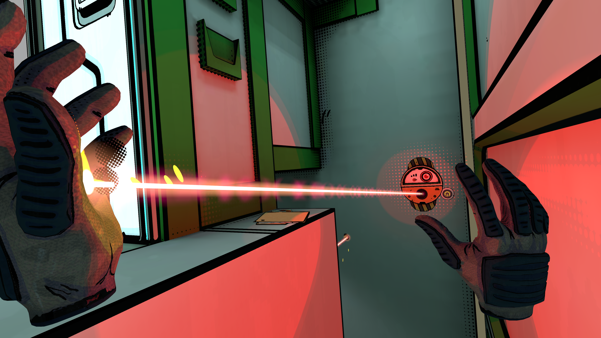
Sharp Lines, Clear Vision
A common problem in VR is that textures can blur when you lean in close. To solve this, we developed a system where black outlines are rendered on every texture with the same technique which keeps fonts crisp.
The result? No matter how close your eyes get to an object, the lines stay super clear and sharp. It makes every prop, gadget, and environment look clean and legible, reducing visual noise and giving the whole game a striking, cohesive style.
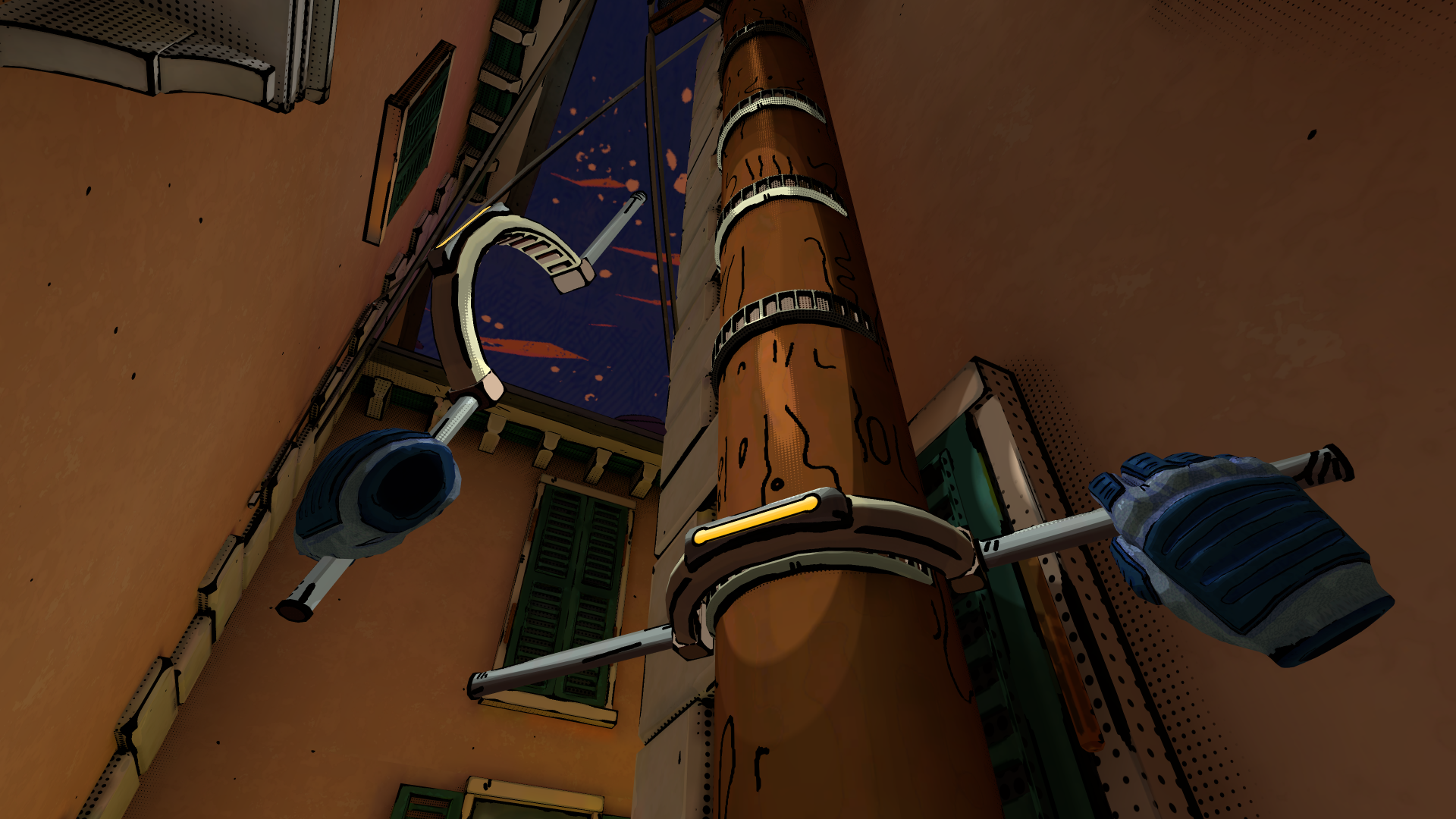
Playing with Shadows
Shadows are often tricky in VR – too dark and they obscure detail, too light and they lose atmosphere. Our answer was to go back to the comic toolbox: half-tone shadows.
These dotted gradients give players just enough visibility to peek into darker areas, while still creating tension by obscuring what’s hiding there. Because they’re built on our same black-line technology, they remain sharp and readable even as you move through them.
It’s a visual effect that’s not just stylish, but functional – balancing clarity and mystery in one stroke.
Style That Performs
All of these techniques – the outlines, the onomatopoeia VFX, the halftone shading – come together into a look that’s visually unique, instantly recognisable, and highly performant.
One of the biggest gains is how well the style performs on mobile VR devices. The clean lines and stylised textures allow us to achieve a bold look without pushing heavy rendering loads, making the game run smoothly while looking unique.
Why It Matters
We’re proud of this comic book styling because it’s more than a skin. It’s an art direction that:
- Reinforces the spy-fantasy feel of the game.
- Supports accessibility for all kinds of players.
- Makes the world easier to read and navigate in VR.
- Stands out visually in a crowded medium.
As one playtester put it: “It feels like stepping into a living graphic novel.”
Closing
Unseen Diplomacy 2 doesn’t just continue the legacy of the first game, it reinvents it in ink, lines, and dots. We’ve built a style that’s bold, functional, and uniquely ours.
Even if you’re just curious about how it all works, we’d love you to see it in action – buy or wishlist Unseen Diplomacy 2 on the store today!